Print at size

Artwork proofed on a desk and output at four metres shows every compression artefact.
What the desk never tells you
Artwork approved on a screen at arm's length and printed at four metres are not the same object. The file that looked sharp in the PDF proof — logos crisp, gradients smooth, text sitting squarely in its box — can arrive on substrate revealing banding in the gradient, a logo that has been resampled twice at different stages of a handoff chain, and a horizon line on a photographic background that sits three millimetres off the panel seam. None of that was visible at 100% zoom on a 27-inch monitor. All of it is visible to a visitor walking past at speed.
The mechanics are simple but often ignored. Large-format inkjet output — the dominant process for exhibition graphics — is typically specified at 72–150 dpi at final output size for viewing distances above two metres. Artwork supplied as a 300 dpi RGB file built at A3 and then scaled up to two by three metres by the print operator has been scaled by a factor of roughly seven in each dimension. Effective resolution collapses. Compression artefacts in embedded JPEGs, invisible at desk scale, become visible bands or halos at panel scale. The fix is not to supply everything at 300 dpi at final size — that would produce files too large to handle reliably — but to understand the viewing-distance logic and build files at the correct resolution for the intended scale from the start.
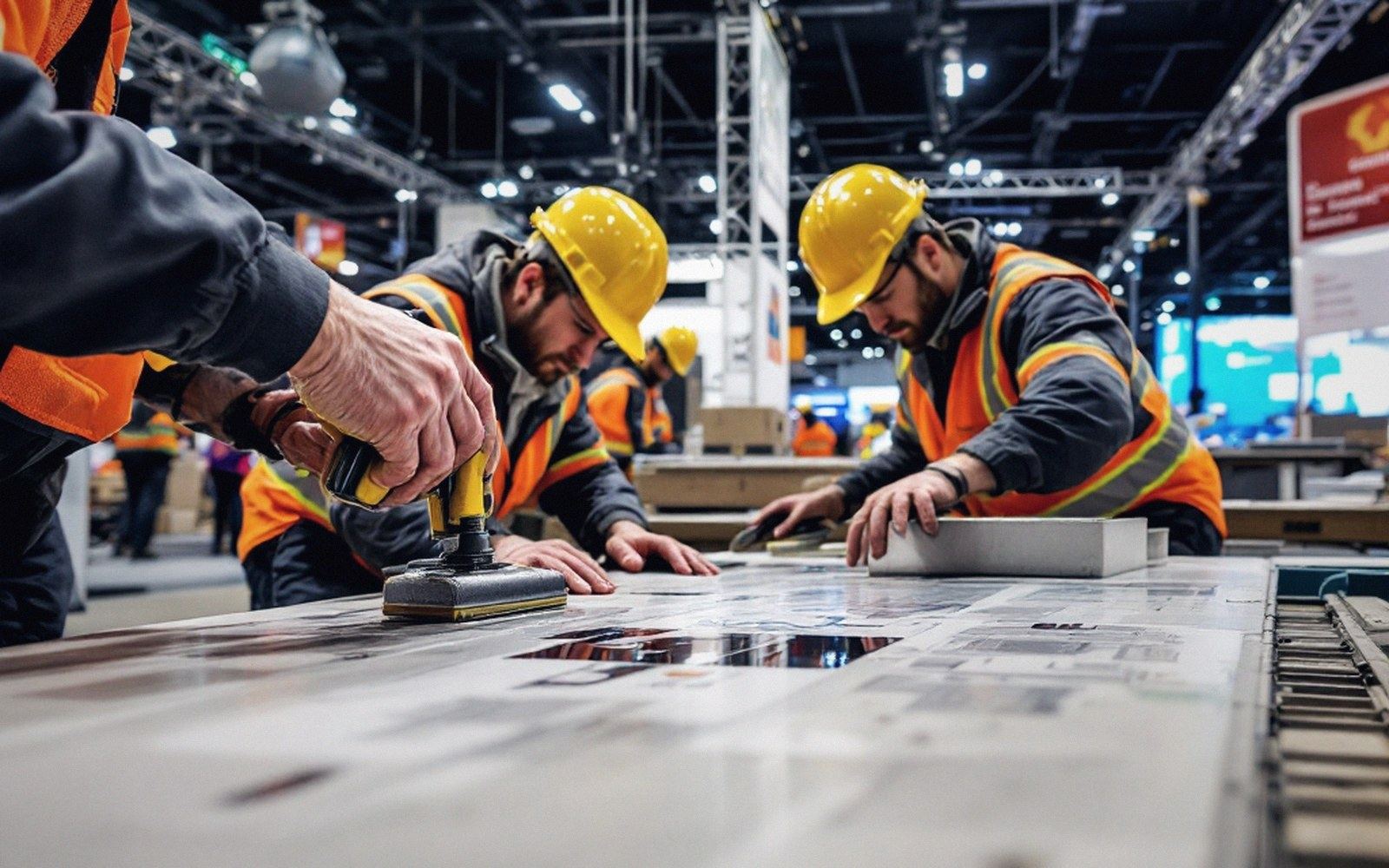 Fig. 02
Wet-applied film is worked from the centre out; a reworked seam costs the whole panel.
Where alignment actually fails
Resolution is the well-known problem. Alignment across panels is the one that creates real site pain. A full-wall graphic spanning four or six aluminium-framed panels is not printed as one piece and then cut; it is printed in sections, each of which must register against its neighbour to within a tolerance the framing system may not reliably hold. If the profile gap is eight millimetres and the graphic has been designed with a continuous horizontal element — a product silhouette, a colour-block boundary, a data line on a chart — that element will step visibly at every joint unless the designer has deliberately avoided placing continuous features across seams, or has accounted for the gap width in the file.
Seam planning is a pre-press discipline, not a site fix. The designer needs to know the exact profile width and the exact panel centres before artwork is finalised, not after. Operators who receive artwork without that information will make assumptions, and assumptions at four-metre scale become three-millimetre steps. The seam is already the first thing a visitor's eye finds; a misregistered graphic makes it worse.
Bleed tells the same story. Standard print bleed for desktop work is three millimetres. For large-format exhibition graphics applied into or over a frame, five to ten millimetres is more conservative and often necessary, because installation is not done under controlled conditions: the substrate is tensioned, the frame may not be perfectly square — as tolerances across a real hall floor make predictable — and the trimming happens on site with a knife, not in a factory with a guillotine. Insufficient bleed means a sliver of white at an edge that no amount of on-site black marker repairs convincingly.
What to send and in what form
Practical rules follow directly from the physics. Build artwork at final output size in a native application — Adobe Illustrator for vector-heavy graphics, Photoshop for photographic work — at 100 dpi effective resolution for distances over three metres, 150 dpi for closer panels, never below 72 dpi. Export as PDF/X-4 or PDF/X-1a rather than RGB JPEG; the print operator needs a predictable colour space, not a display-optimised file. Embed all fonts or outline them — a large-format RIP encountering a missing font will substitute, and substitution at banner scale is catastrophic. Provide a dimensioned layout drawing alongside every file showing which file maps to which panel in the build, with the seam positions marked.
Colour is a separate problem with its own correction logic, and the profile of the substrate matters: a print on backlit film behaves differently from the same file on a matte polypropylene banner. Specify the substrate before the file is built, because the print operator will apply a profile to it, and if that profile was not in the designer's mind when the gradient was tuned, the site result may not match the screen proof at all.
Alignment across panels is the one that creates real site pain.
Artwork is not finished when the client approves it. It is finished when it has been proofed at size, on the actual substrate, under conditions close to the hall.

Panel joints are the first thing a visitor’s eye finds, so artwork is set to fall away from them.